Re-platforming

Context
Shutterfly was operating on an outdated platform. Innovation was extremely difficult. Product builders were on different technologies. The experiences were inconsistent, out-dated, and did not provide the creative flexibility that customers desired.
After merging with Snapfish, Shutterfly had access to a more modern multi-tenant platform better suited for their needs. The decision was made to move to the Snapfish platform.

Goal
Move to the new platform. Reduce technical debt. Improve the customer experience and put Shutterfly in a place where it can innovate much more quickly.
The new experience should maintain familiarity. Keep all significant features. Improve usability. Add features available on the new platform. Provide consistency across builders. Position Shutterfly to more easily innovate and provide expanded creativity.

Challenges
Timelines were extremely tight. We had to be very efficient and closely coordinate design development with user testing and engineering to accomplish all we needed.
There was a high level of design complexity. We had to create a new book building experience that integrated the experience from 3 different book builders. In addition to books, we needed to bring all of the product builders (books, cards, calendars, wall art, prints, multi-surface products...) into the new architecture while maintaining features, improving usability and adding new features. We needed both desktop and mWeb, which have independent and distinct experiences.
It was a large and complicated project. In addition, other areas were also being designed and updated (account, projects, cart...).

Our result
We designed over 1300 screens for desktop and mWeb, and performed over 300 user testing sessions, in a matter of months. We moved quickly and efficiently and worked closely with customers to ensure a high level of confidence in the new experience.
The new experience has both a higher conversion rate and a higher average order value. This enabled the business to transition to the new experience more quickly than planned.
Photo Books
Shutterfly had 2 different book building experiences and a lot of sensitivity around any changes to the older experience. A 'redesign' had been attempted in 2019-20 and it resulted in a significant loss of revenue, a lot of frustrated customers, years of re-work, and ultimately the re-introduction of the older experience.
Our approach was considerably different and was much more successful. We started by interviewing customers who used the older experience. We saw how they were using it and the photo books they produced. We dug into what they liked about it and what frustrated them about it. We also showed them features and experiences on other sites to get their input. We continued with user testing throughout design development. We worked with engineering to build a robust prototype, allowing customers to use their actual photos when testing.
The new design maintained all significant features from both book builders, as well as incorporated new features available on the new platform, including a new scrolling view.
By staying very close to customers, we were able to craft a successful redesign that has both higher conversion and higher average order value.
Main views
The new architecture moved photos and all design elements to left side trays. Photos were previously on the bottom for some experiences. Because some users felt they still preferred their photos on the bottom (a smaller number of users, but it was strongly felt) we enabled the ability to select the position of the photo tray for books - either left or bottom.
We introduced the new scrolling view (users really loved this), added the ability to expand the left side trays, added the ability to easily move elements, and improved usability on many features.
Spread

Scrolling

Arrange

Expanded photo tray

Photo Cards
Photo cards generate a lot of revenue and are an extremely important part of the business. We wanted a high level of confidence on any changes we introduced. We created prototypes and did multiple rounds of testing. The new architecture created a larger view of the product and working area, enabled greater design flexibility, and improved usability issues. A particular area of focus was the envelope and addressing experience. In the original experience there was confusion and we wanted to alleviate this. We added highlighted messaging showing what addressing options are available with the selected envelope. When viewing envelopes we added a side tab for addressing options (and vice versa) so you can easily move between the two. We clarified and simplified the addressing options in the side tray. We made it easier to add and import addresses. We also made it easy to select an addressing option and update your envelope if needed.
Front of flat card

Back of flat card

Envelope selection

Addressing selection

Calendars
Photo calendars are similar to photo books in that they are a more complicated product to build, and have a very devoted and passionate group of customers. We worked closely with customers to ensure we understood what was important to them, and identified areas of improvement. In particular we introduced an "all months" view to get an overview of the calendar, simplified the interaction to create custom dates, and introduced the ability to add more text to dates - which was a big customer ask.
All months

Single month

Full month

Custom date
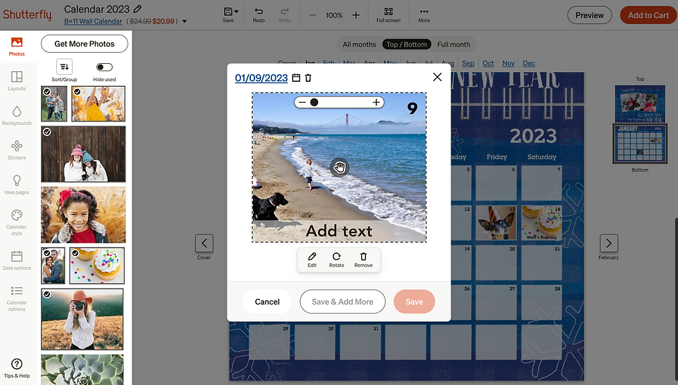
Photo Canvas
The product view and work area got much larger in the new architecture. Designs became more flexible. The wrap of the photo canvas can now be displayed. Cropping interaction was simplified, and you can now crop directly on the product.
Photo Canvas - Unframed

Photo Canvas - Framed

Photo Canvas - Preview

Photo book up-sell screen
As part of the re-platforming project, we redesigned the photo book up-sell experience. We were able to develop and test this on the original site before bringing it to the new site. It outperformed the legacy experience with an incremental lift of $1M+
Books up-sell - new design
The new up-sell experience put all of the options on 1 screen, rather than showing a series of popups.

Books up-sell - original
The original experience showed a series of 5+ popups.


mWeb Screens
Each of the builders had to be designed for mWeb as well. The features and interactions are different and optimized for mobile.
Photo Books
Arrange view

Spread view

Page view

Calendars
Month view

All months view

Custom date

Photo Cards
Front of flat card

Back of flat card

Envelope

Photo Canvas
Canvas - unframed

Canvas - framed
.png)
Canvas - preview
