Simplifying Checkout


Context
CVS was receiving customer feedback about confusion in the checkout experience, in particular about selecting pickup or ship. Pickup is a primary need for their business, and an important driver of foot traffic to their stores.

Goal
Improve the checkout experience and clarify the fulfillment options (pickup, ship to home, ship to store). Reduce confusion and boost satisfaction, as measured by customer feedback and CSAT scores.

Challenges
We were on a short timeframe and needed to execute very quickly. Additionally there was a lot of underlying complexity. Products have different fulfillment options and even when pickup is available, specific store locations vary in their fulfillment capabilities. Payment requirements also vary depending on fulfillment method and order amount. This created a lot of additional states we needed to handle.

Our Result
3% lift in checkout conversion.
Increased CSAT.
Reduced complaints in customer feedback.
Design Development
1
We researched the feedback from customers and dug into the issues. We quickly developed initial concepts and tested with customers to get early feedback.
2
We narrowed in on a direction and created prototypes that took users through the full journey to provide realistic context when gathering feedback.
3
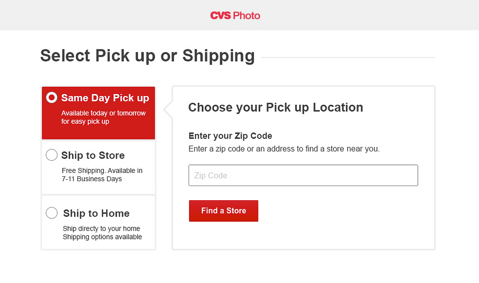
As we refined the design, we continued to do rapid testing to validate details—such as whether the tabs appeared clickable enough or if radio buttons were needed to improve clarity.
4
We finalized the designs and launched an A/B test against the original experience.
Initial Concepts - Desktop
We created 4 initial desktop concepts to test with customers: options presented in tiles at the top, with info below; options at the top with visible checkmark icons, with info below; left side tabs and info on the right; radio buttons at the top and info below.


Initial Concepts - mWeb
We created 4 initial mWeb versions to test with customers: defaulting to pickup in a dropdown; defaulting to pickup with a 'more delivery options' CTA; no default, and the user is presented with the 3 options to choose from; tabs across the top, defaulting to pickup.


What we learned
For desktop, the left-side tabs tested the best. The options were easily scanned and it created the best association between the choice and the corresponding information. For mWeb, the tab version tested the best. It allowed defaulting to pick up while keeping the other options visible.
We iterated on the designs and did more testing to reach the final design.
Final Designs
On desktop, we used side tabs to create a clear association between the selection and its corresponding information. We also added radio buttons to reinforce that the user was making an active choice.
mWeb
On mobile web, we used top tabs, which allowed us to default to "Pickup in Store" while keeping all options visible and easily accessible.
